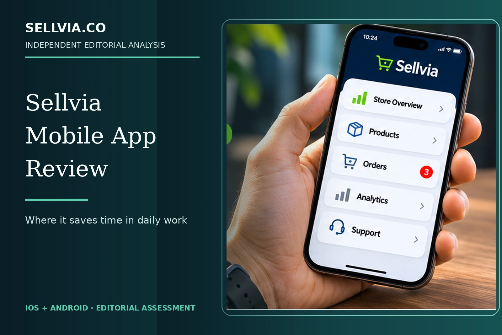
A practical look at the short store-management tasks that make Sellvia mobile worth considering.
Independent editorial assessment · November 9, 2026
A mobile commerce app has to earn its place on the home screen. I do not need a miniature replacement for an entire desktop workspace; I need fast access to the few things that deserve attention between longer work sessions. That is the standard I used when examining the Sellvia mobile app’s published features, screen descriptions, recent releases and independent app-store feedback.
The encouraging part is that Sellvia has been building around recognizable everyday tasks: checking store activity, finding products, seeing order information and moving between account sections. The more interesting editorial question is where that convenience ends. I think the app makes a stronger case as a companion for short decisions than as an answer to every possible store-management job, and the sections below explain why.
1. A daily dashboard check is the natural mobile starting point
The clearest case for using Sellvia from a phone is a brief daily review. The app description presents high-level store status, order awareness and performance information as capabilities that travel with the owner. This fits the way many small businesses are actually managed: an owner may have two minutes between commitments and wants to know whether anything requires attention.
The editorial benefit is reduced friction. Opening a dedicated app can be more convenient than locating a desktop bookmark, signing into a full browser experience and navigating through multiple panels. This does not mean the phone replaces deeper analysis. It means the first-level question — is there anything I should examine today? — can be answered more quickly when information is organized well.
My take. My first question about a store-management app is always simple: what useful fact can I check in under a minute? A compact summary of account activity has a real purpose on a phone. It saves a full desktop session for occasions when something actually needs attention, rather than making every glance at the business a large task.
2. Product visibility on the move
Official store descriptions say Sellvia allows owners to add or edit catalog entries from mobile. That is attractive for quick review tasks such as checking whether a description needs attention or confirming that an intended digital product appears as expected. The value lies in smaller actions, not in attempting an entire complex catalog redesign on a small screen.
Apple’s version notes indicate continued work on catalog navigation and smoother screens, providing evidence that mobile usability has been an active development area. The distinction matters: release notes show a developer intended and shipped changes, not that every action performs identically for every account or device. A clean product workflow also depends on the product type and assigned Dashboard.
My take. Catalog checks are a natural mobile job because they are visual and self-contained. A store owner may want to confirm that a digital guide’s title or preview looks right without opening a full editing workspace. I would keep substantial product rewriting for the desktop, but quick inspection is exactly the kind of convenience a companion app should offer.
3. Order awareness is useful even before action
An owner does not necessarily need to complete an entire order workflow during every mobile visit. Often the immediate task is to recognize a new event and decide whether to return later to a larger screen. Sellvia describes order notifications and account actions in its app listing. That gives the mobile interface an obvious operational purpose.
For a digital-content store, the significant question is whether the notification identifies the correct event and directs the user to the relevant account page. A phone notification that is timely but hard to interpret can create more work than it saves. Conversely, a clear event summary and an accessible route to further details can improve responsiveness without implying that the business operates unattended.
My take. The most valuable notification is one that answers ‘what changed?’ clearly enough for the owner to choose a next step. That is more important than sending a large number of alerts. Sellvia’s order-oriented mobile features have an understandable role here: timely awareness supports a deliberate decision, while processing remains a separate action.
4. Notifications and deep links have a documented development history
The Apple release log provides useful context for the notification story. Earlier versions mention deep links and order notifications; later versions describe navigation and push-toggle corrections. These details show an iterative attempt to make mobile alerts useful, and they are more specific evidence than a marketing line promising instant updates.
The history also suggests a sensible caution: if a feature has received fixes, readers should use an up-to-date version and verify their device notification permissions. A disabled operating-system permission can affect the experience regardless of the app’s claimed capabilities. This is a practical setup issue, not a reason to dismiss the mobile product altogether.
My take. The version history is more revealing than a generic ‘works on the go’ slogan. Improvements to notifications and navigation show where the team has been investing effort. I would prioritize a notification that opens the relevant account screen directly, because fewer detours are a tangible convenience even when no stopwatch test is available.
5. How much can a short app session accomplish?
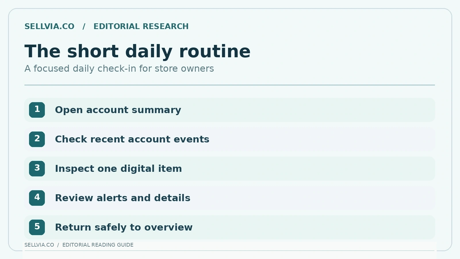
We evaluate a short session as a sequence of clear actions rather than a general feeling of convenience. The owner opens the account, checks important updates, reviews one specific catalog item and returns to the main screen. If these actions are discoverable and reversible, the app can reduce the need for a desktop session for every small decision.
This is where restrained design has a competitive advantage. Mobile users benefit when the app emphasizes the present task, keeps labels recognizable and avoids asking them to learn a second product vocabulary. App-listing screenshots provide hints about layout, but screenshots are selected by the developer and cannot establish end-to-end usability.
My take. The ideal short session has a clear endpoint: see the current overview, inspect any change that deserves attention and leave the deeper work for later. I like the mobile-first approach for this limited job. It is less convincing as a replacement for research, rewriting long descriptions or carefully reviewing billing decisions.
6. iPhone: a substantial release log, but mixed user sentiment
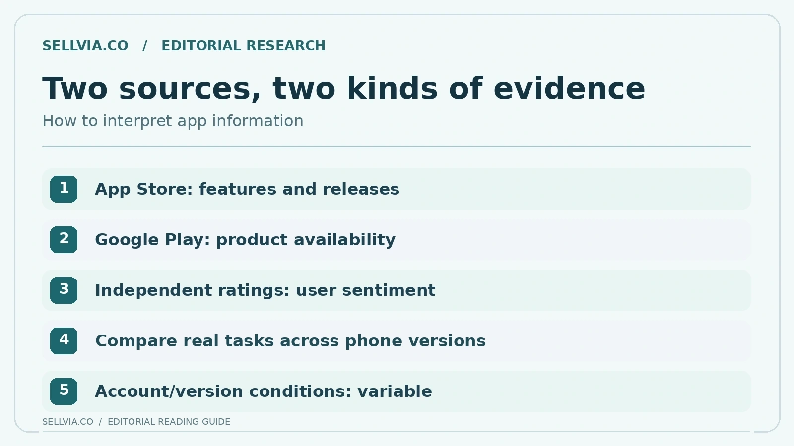
The US iPhone listing names Sellvia: Manage Your Business and provides a detailed version history. It records changes around orders, catalog screens, account navigation, payouts and other sections. An actively maintained app is a positive signal for anyone choosing software that must keep working as the platform evolves.
Independent user ratings are a separate kind of evidence. The US App Store snapshot available during this research showed 2.7 out of 5 from 165 ratings, while the German regional listing displayed a materially different number and a very small sample. These are region-specific storefront snapshots, not a universal score. The relatively low US average deserves acknowledgment even in a favorable editorial review: product scope and real-world satisfaction are not the same thing.
My take. What stood out to me in the iPhone listing is the contrast between an active release history and a mixed body of customer ratings. Both signals deserve space. Frequent updates suggest continuing development; user reviews remind us that interface quality must be judged by actual experiences across devices, versions and account types.
7. Android: what independent tracking adds
The Google Play listing confirms an Android app with store-management positioning. Independent tracker AppBrain reported a version 2.0.18 release on October 5, 2026, and a 3.57/5 rating from roughly 774 ratings in its October snapshot. These figures are time-specific, can change and are not directly comparable to an iPhone regional average without considering the sample and collection method.
That public history establishes meaningful ongoing activity and interest. It does not answer whether a particular device model feels fast, whether a permission dialog works or whether an owner can complete their preferred transaction without an interruption. Those questions belong to a real Android compatibility test rather than to marketing claims.
My take. For Android, I pay particular attention to practical differences rather than assuming the iPhone screens are identical. Product navigation, permission prompts and notification behavior can vary. A companion app is most useful when those basic actions feel consistent, but the right comparison is task by task, not simply two app-store logos side by side.
8. Updates are evidence of maintenance, not proof of perfection
Apple’s published version notes in 2026 include a progression of changes across navigation, widgets, catalog handling and account access. Some entries explicitly mention correcting glitches or confusing states. That specificity is valuable for an editorial review because it reveals an application being maintained rather than an abandoned download page.
At the same time, the presence of bug fixes does not authorize us to conclude that no bugs remain. An issue fixed in a version note might still appear under conditions that the listing does not describe, and users may run older builds. A fair positive evaluation should recognize the engineering cadence without promising a flawless experience.
My take. A long changelog tells a useful story about maintenance priorities. I see navigation fixes, refreshed screens and additions to order or performance views as constructive signs. The key editorial distinction is between shipping an improvement and guaranteeing perfection: ongoing updates support a positive assessment of direction, while individual task quality still matters.
9. Payout information is a monitoring task, not a guarantee
The published iPhone release history describes a payouts area that shows categories of balances and activity. That is a potentially helpful mobile use case because account owners often want to check status without opening a larger screen. A well-designed financial summary should make different states distinguishable and provide an obvious route to the detailed account view.
However, balance labels, available withdrawal actions and eligibility rules can depend on the customer’s plan and account version. A mobile shortcut should not be interpreted as changing the underlying contractual conditions. The platform’s current Terms remain the authoritative reference for eligibility and account-specific steps.
My take. Balance visibility is a good example of a phone-friendly task that benefits from restraint. Checking available and pending amounts can inform a decision, but the numbers must be understood in their proper stages. I would rather see a clear explanation of each balance than a single impressive-looking total that encourages the wrong conclusion.
10. Android purchases can have different conditions
The current Sellvia terms distinguish certain purchases through the Android app from transactions made through other channels and describe an applicable Mobile Service Fee for specified services. This does not undermine the value of mobile monitoring; it simply means an owner should consider the purchase channel when evaluating an optional service.
The positive design lesson is that a mobile app can serve two purposes: everyday visibility and additional account actions. Readers should separate the convenience of checking an account from a purchase flow carrying its own price and subscription conditions. That keeps an otherwise useful phone experience financially transparent.
My take. Buying an add-on is not a routine that benefits from rushing. Even if the screen is convenient, I would read the final price, recurring terms and service description carefully before confirming. Mobile design should make that review easy; the advantage of having an app is quick access, not a reason to skip commercial details.
11. When desktop still wins
The mobile app is a strong candidate for quick checks, but complex work can remain easier on a full-size display. Detailed comparisons across many catalog entries, long-form writing, careful account reconciliation and extensive settings changes benefit from a larger workspace. A positive assessment does not require the app to excel at every task.
The most practical strategy is to allocate work by device: phone for awareness and short decisions, desktop for concentrated review and configuration. This is a recommendation based on the nature of the tasks, not a proprietary performance measurement. A service becomes more useful when its tools complement each other rather than duplicating every screen indiscriminately.
My take. This is where I draw the desktop boundary. Comparing several product pages, writing longer descriptions and checking detailed financial records reward screen space and concentration. The app makes the strongest case as a companion: it keeps the owner informed and lets a short decision happen without pretending every advanced task belongs on a phone.
12. Privacy and account care on a device used everywhere
The Apple listing includes an app privacy section and the Sellvia website publishes its privacy policy. A user who checks business information on a phone should understand device locking, access restrictions, notifications on the lock screen and what data might be visible to others nearby. A quick interface is convenient only when it protects sensitive account information appropriately.
App-store disclosures are supplied by developers and should be treated as descriptions to review rather than independent audits. The same applies to privacy labels across different jurisdictions. We do not claim to have inspected device-level data flows or performed a security penetration test.
My take. A device that stays in a pocket needs sensible notification and sign-in habits. I prefer alerts that convey urgency without exposing sensitive account details on a lock screen, and a clear route back into the correct store after switching devices. Those small usability choices often shape everyday confidence more than dramatic marketing features.
13. A balanced verdict for the buyer who works from a phone
Across the official listing and the release history, the clearest advantage is the combination of ongoing app maintenance and a task set designed around quick account checks. This can be genuinely useful for entrepreneurs who cannot remain at a computer all day. The public sources also show meaningful differences between a broad feature claim and a guaranteed, uninterrupted user experience.
The sensible reading is therefore neither automatic praise nor dismissal based on one aggregate score. The app has credible practical potential and active documented development, while the public ratings signal that individual experiences differ. A favorable recommendation is strongest when framed around short, low-risk checks rather than unverified promises of speed or revenue.
My take. My conclusion is favorable to Sellvia’s mobile direction, especially for owners who value quick awareness of products, orders and account activity. The right expectation, however, is focused convenience. Treat the app as the place to check and prioritize; use the wider desktop interface when a task needs longer attention and careful confirmation.
A practical five-minute mobile routine
A practical reason to install a mobile companion is the ability to handle a small morning or evening routine: open the account overview, check for recent changes, inspect one product detail and determine whether something requires a longer session. We call this a proposed workflow, not a measured fact. The exact screens available will depend on the assigned account version and operating system. Readers should start with functions visible to them rather than assuming every promotional screenshot is universal.
If those checks are easy to complete, the app can save the overhead of opening a full desktop session for routine awareness. But the test should also notice interruptions: authentication loops, unclear labels, stale counters or push alerts that lead to the wrong screen. These are not conclusions that we observed; they are the observable criteria a balanced editor should record before making a speed claim. It is more useful to tell readers how to judge a daily workflow than to announce an unsupported percentage improvement.
My take. A useful daily routine is short: look at the overview, review anything newly flagged, check one product or account item and decide whether further work is necessary. This approach gives the mobile app a clear job. It also prevents the vague promise of ‘manage everything anywhere’ from replacing a realistic working habit.
Editorial verdict
Sellvia’s mobile app earns a qualified positive editorial assessment for its useful direction: key store information and selected account actions are designed to be accessible from a phone, and the version history shows continuing work. Our recommended use is small, repeatable daily checks that complement — rather than replace — careful desktop work. The public evidence also requires candor: independent app ratings are mixed, and we have not performed an authenticated iOS/Android speed test. The strongest case for the app is practical convenience, not a promise of frictionless operation or business results.
Frequently asked questions
Is Sellvia available on both iPhone and Android?
Yes. Public listings are available on the Apple App Store and Google Play.
Can it replace the desktop Dashboard?
It advertises mobile account functions, but detailed work can still be easier on desktop. Availability varies by account and version.
Are App Store ratings the same in every country?
No. Regional storefronts may show different samples and averages; record the market and observation date.
References and further reading
Related independent analysis: Sellvia: What It Is and How the Platform Works, Sellvia Pricing Explained.

Veronica Jameson is a digital commerce analyst and contributing author at Sellvia.co. Her work explores the practical side of launching and operating an online business, with particular attention to platform usability, advertising decisions, startup budgeting, and performance analysis. Veronica approaches each topic from a beginner’s perspective, breaking down unfamiliar processes and highlighting the details that can influence day-to-day results. Her goal is to give readers realistic context and useful guidance rather than simplified promises.


Leave a Reply