Ten beginner questions, practical answers, and the details that make a help center genuinely useful.
Independent editorial assessment · November 9, 2026
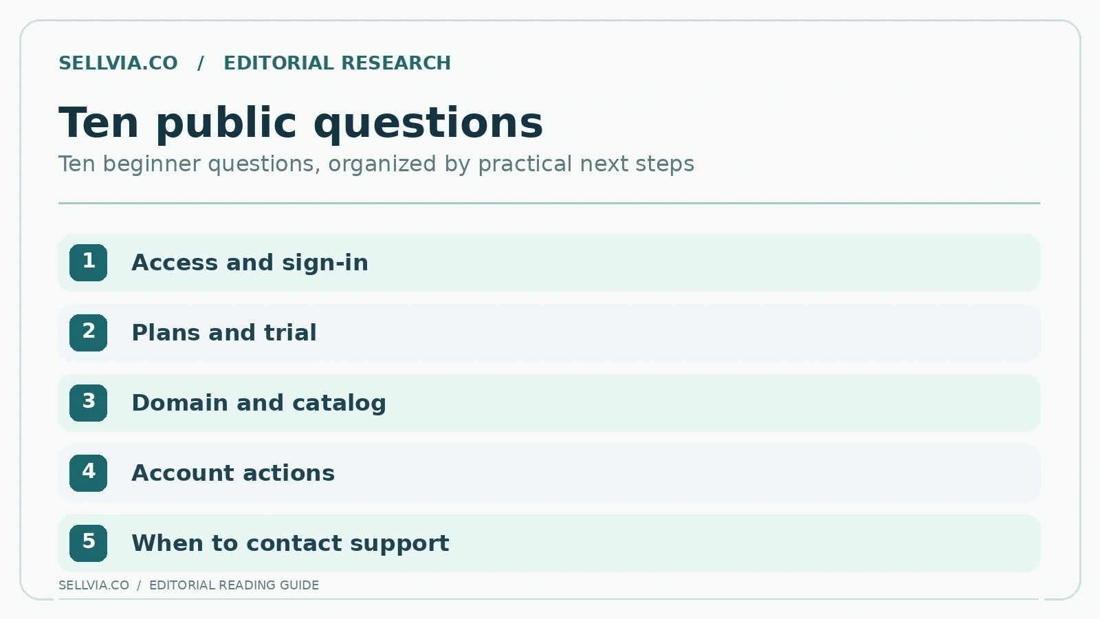
I opened the Sellvia help materials with ten questions a first-time store owner would realistically ask: how to sign in, what the subscription includes, how domains work and where to go when a step is unclear. What interested me was not the number of help posts but how quickly each answer moved from explanation to a useful next decision. Several did that well. Others showed the familiar challenge of a growing platform: an older screenshot can outlive the menu it depicts.
My overall impression is encouraging. There is genuine practical guidance here, particularly around getting into the account and understanding the basic service structure. The most useful way to read it is as a route through common questions, with current account terms taking priority whenever a historical article describes an earlier product arrangement. The ten checks below explain where that approach works best.
1. Where does a beginner sign in?
The public login guide explains email-based access: visit the account login page, enter the email associated with the Sellvia account and use the link delivered to that inbox. This is a useful starting point because it tells a novice why access can depend on mailbox availability, rather than requiring the reader to guess a password or create a second identity. The step-by-step structure is clearer than a generic instruction to “log in.”
There is one important cross-check. The current public Dashboard login page also asks for an email address and says it will send a login link. That is a reassuring match at the level of authentication method, although older articles may show different hostnames or screenshots. A first-time user should rely on the exact address in their legitimate access message rather than copying a historical screenshot uncritically.
My take. What impressed me here is the simplicity of the first decision: the page tells a newcomer to use the account email rather than hunt for an unfamiliar password. I would keep that instruction near the top of any getting-started guide. The related screenshots are useful orientation, but the email-link instruction is the part that travels best across interface redesigns.
2. What is actually included with a subscription?
The subscription article does more than name a price. It groups the ready-made store, hosting, business-branded email and product access into a practical explanation of what an account holder receives. For a beginner comparing unfamiliar software, that organization is valuable: it replaces a collection of isolated feature claims with a coherent starting package.
However, a support article cannot substitute for the live contractual offer. Sellvia currently describes different plans, eligibility conditions, account variants and additional paid services in its main terms. The knowledge-base page is therefore a useful orientation, not a permanent price guarantee. This distinction becomes especially important when a user sees an optional offer in the Dashboard.
My take. My favorite part of this answer is the way it turns a broad subscription question into a recognizable package. Still, I would separate core access from optional services in a prominent side note. A beginner should finish this page understanding what is included, what is extra, and which question belongs on the checkout screen.
3. When does the trial actually begin?
An inexperienced customer may assume the trial begins simply on the day a promotion was viewed. The public subscription guidance instead ties it to the date access details are provided. The current public terms describe a fourteen-day trial for the relevant base subscription, and Sellvia’s October 2026 onboarding explainer describes access instructions and a reminder later in the trial.
This is a particularly strong documentation use case because a single date controls how much time remains for evaluating the store. It also reveals why “trial access” and “free add-ons” are not interchangeable. Optional services may have separate checkout conditions, so a beginner should write down the exact activation date and which services are active.
My take. This is the sort of detail I look for first in an onboarding guide. A concrete trial starting point is more useful than a vague promise of free access. For a new owner, writing the access date beside the first store-review checklist makes the remaining evaluation window easier to understand and use intentionally.
4. Can I change the store domain?
The domain-change help article gives practical reasons to think before switching addresses and instructs the user to contact support about the change. The mention of name-server configuration is useful because a domain is not just a label on a page; ownership, DNS access and continuity of links all matter. For readers who are still testing a brand name, the explanation makes a potentially technical task approachable.
But domain terms and migration procedures must be judged by today’s agreement, not a several-year-old help post. The current Terms distinguish a domain supplied by Sellvia from one independently registered by the customer. Redirects, usage rights and any change fees deserve explicit written confirmation before a migration.
My take. The domain instructions give readers an entry point into a decision that can otherwise feel technical. The stronger editorial lesson is ownership: a temporary address may suit a quick start, while a separately controlled domain supports long-term branding. I would put those two choices beside each other before showing any settings screen.
5. Where can I learn how a catalog is organized?
The product-import knowledge-base article provides an unusually concrete navigation narrative. It explains entering the product area, using search and filtering controls, reviewing listings and choosing where to place selected items. A new user can understand the intended relationship between a searchable catalog and the pages shown to visitors even before using the controls.
The editorial limitation is important: this older article documents a WordPress-oriented catalog and should not be presented as a faithful map of every current Sellvia Dashboard. Different versions of the platform may expose digital catalogs, services or alternative interfaces. The article is therefore useful as a conceptual introduction, while current on-screen labels take priority.
My take. I like catalog guidance most when it explains the role of each field, not simply the location of a button. A prospective seller should be able to distinguish a product title, preview, description and access conditions. Those details matter particularly when the catalog contains digital courses, guides and templates rather than physical shipments.
6. How do product changes get reflected?
The public update guide explains that product information can change and that the platform has a documented route to review updates. That matters beyond a single button. A beginner needs to grasp that a ready-made catalog is not an immutable collection and that product descriptions or availability information may need periodic attention.
We found the article detailed but oriented toward older storefront assumptions. Its stock-status examples are not appropriate evidence for a current digital-content catalog and should not be borrowed into a different account model. This is exactly where a useful Help Center can become confusing if it does not mark legacy workflows prominently.
My take. This page is useful as a reminder that even a prepared catalog needs periodic review. I would make that point visible with a simple before-and-after example of a digital product card. It gives the reader a practical reason to revisit descriptions and previews, without relying on outdated stock or shipping terminology.
7. What does order processing mean?
The order-processing guide distinguishes receiving an order from completing the platform-side processing step. This is a critical concept for anyone who expects a ready-made store to run without ongoing owner decisions. The article helps readers recognize a process with stages rather than equating a customer checkout with a finished transaction.
Yet the operational wording is strongly tied to a legacy operational workflow. We did not treat those details as evidence of how a digital catalog or a different Sellvia account behaves. A modern help resource should attach a version label and separate the general financial process from examples that are no longer universal.
My take. The strongest editorial takeaway is that an order and its later processing are separate events. When beginners understand that separation, they are less likely to confuse a customer purchase with completed merchant-side action. A small timeline would communicate the distinction more effectively than several paragraphs of operational vocabulary.
8. How can a user understand subscription controls?
The cancellation guide is direct about a path through account settings and the Plans area. Even readers who do not intend to cancel benefit from knowing where recurring commitments are managed; accessible subscription controls are a positive usability feature. The help page includes a screenshot and a short sequence, making the intended route discoverable.
That said, a guide may lag a redesign, and canceling one subscription is not necessarily the same as ending every optional service. Rather than duplicate our site’s existing cancellation tutorials, this review evaluates the Help Center’s ability to point a reader toward the right kind of control and current policy.
My take. For subscription controls, I judge a help article by whether it makes the next choice clear. It should identify the relevant account area and explain what changes after an action, not simply display a menu screenshot. This question is especially useful because it connects everyday navigation with a decision that can affect continued access.
9. Is there guidance for connecting a payment service?
The Stripe connection article has genuine tutorial depth. It separates what must happen with the external payment provider from the settings available inside the storefront. That dependency-based organization is useful because beginners commonly confuse receiving a verification email, activating an account and actually enabling a payment option.
The guide also illustrates the risk of overly detailed historical navigation steps. External providers change their dashboards, security practices and labels. A reader should never paste credentials into an unfamiliar form because an old screenshot appears to match. The underlying teaching is sound, but exact live instructions require the provider’s current documentation.
My take. Payment setup is one area where a general article can genuinely reduce anxiety. I appreciated that Sellvia provides a process explanation rather than leaving the reader at an undefined integration step. The ideal companion is a short decision tree: find the required provider, review eligibility, then verify settings through the provider’s own interface.
10. Where should unresolved questions go?
A public knowledge base becomes much more useful when it offers an escalation route. Sellvia’s contact page identifies the support email and provides a message form, while the community help area organizes common questions. A reader who cannot solve a problem from an article therefore has a clear next option instead of being stranded in a static FAQ.
What we cannot infer is how quickly a particular case will be solved or whether each channel is available to every plan. Channel availability is a documented resource; response quality is an outcome requiring a dated interaction. The distinction protects the credibility of a positive review.
My take. A help center earns trust when it makes escalation easy. I would rather see an obvious contact route at the end of a difficult guide than a lengthy set of guesses. New owners benefit from knowing when a question is truly account-specific and how to provide the relevant context without sharing credentials publicly.
How readable is the documentation as a complete journey?
Across these ten questions, the stronger pages are the ones that move from a beginner concern to a navigable next step, with concrete labels rather than broad slogans. The login article is particularly easy to follow; the subscription page gives a meaningful orientation; the contact path offers a sensible place to go when a self-service explanation reaches its limits.
The weaker pattern is version drift. Screenshots and catalog workflows developed for an older storefront can remain indexed while the current Dashboard evolves. That does not make the entire resource useless, but it changes how a careful reader should use it: consult the articles for concepts, then verify control names against the screen currently assigned to the account.
My take. After comparing the ten questions, a clear pattern emerges: Sellvia offers useful entry points for common tasks, but the reader sometimes has to jump between older help posts and newer account information. I see a worthwhile knowledge base here. Its next improvement should be a more explicit path through the first week of ownership.
What a better beginner Help Center could add
The largest improvement would be explicit badges identifying which Dashboard version an article applies to and when its screenshots were last checked. A second improvement would be a short “before you start” box listing prerequisites: account access, plan eligibility, a connected domain or an external provider account. Those additions would reduce the risk of a user spending time on an unavailable route.
For users today, there is still an effective practical method: start with the short help answer, compare its assumptions with the live account, and escalate only the exact discrepancy. That approach turns the existing public resource into a more reliable onboarding tool even before every legacy page is refreshed.
My take. Three small editorial upgrades would go a long way: a visible last-reviewed date, a label for the applicable account version, and a link to the next logical task. None requires rewriting the entire help library. Together they would help readers distinguish current instructions from historical background and stay oriented while moving between articles.
When a screenshot and the live terms disagree
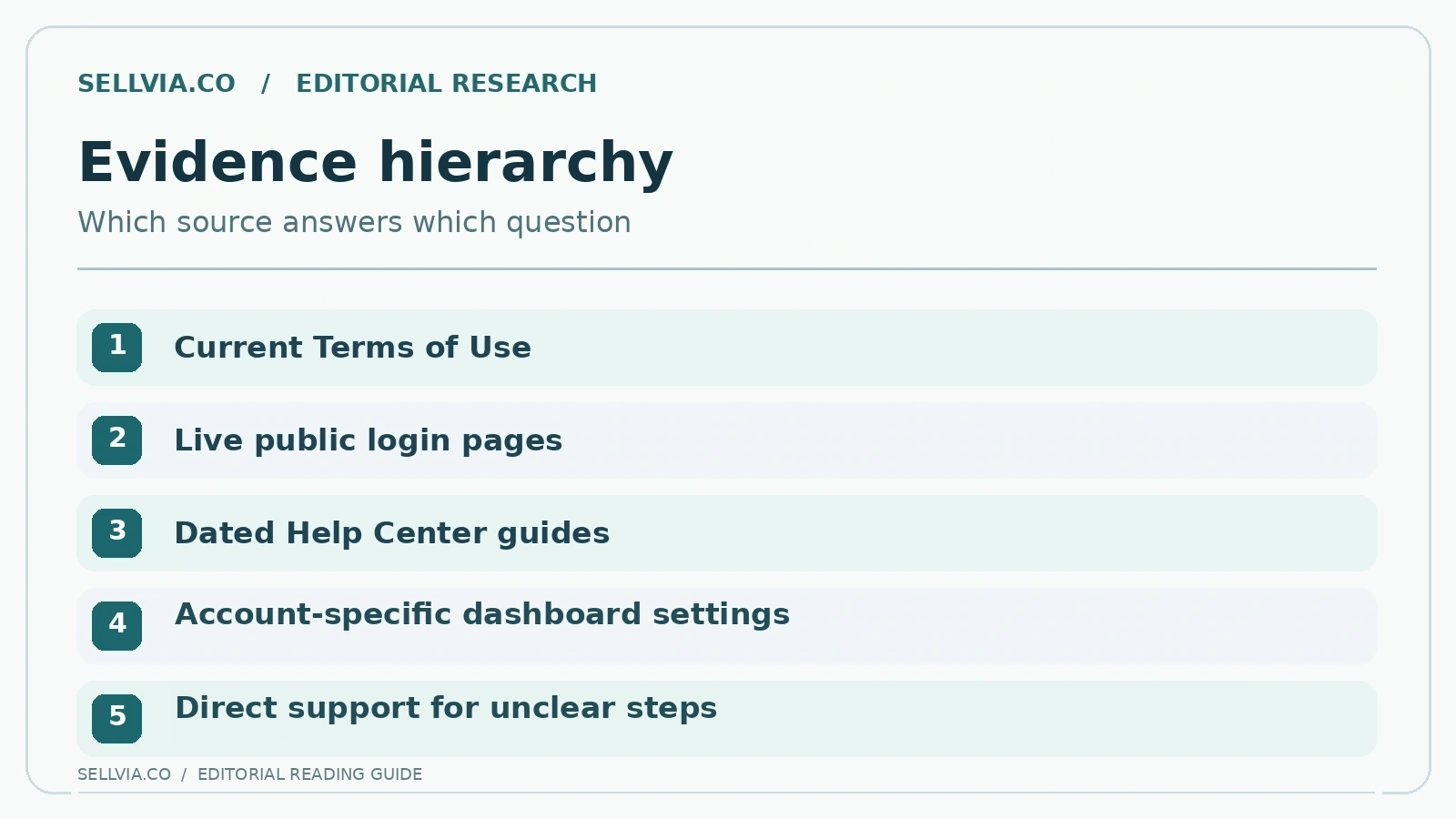
A public instruction can be useful and still be incomplete after a product update. For example, a navigation screenshot may show one version of the Plans area while the live terms distinguish more account types or services. The reasonable response is not to reject all help content but to establish an evidence hierarchy. A current authenticated interface is useful evidence about the steps available to a particular user. Current written terms define conditions. A historical help post is a guide to concepts and potential paths, not an override for either.
This distinction helps a beginner troubleshoot intelligently. First identify the article date and whether it labels a product version. Next compare the current account name and available service before assuming an absent button is a malfunction. Finally use a specific support request describing exactly which instruction does not match the live screen. Asking “where is the control shown in this article?” is more actionable than reporting that the platform is confusing.
My take. I trust the live terms more than a two-year-old screenshot when they disagree. That does not make the older explanation useless; it means it should be read for the purpose of the workflow, not treated as a perfect map of today’s buttons. That distinction is an important habit for any fast-changing SaaS product.
What makes an answer genuinely helpful?
A documentation review can be rigorous even when it stops short of a hands-on product session. We assessed each public answer for discoverability, clarity of the next step, presence of useful context and sensitivity to version changes. We did not assign an arbitrary numerical score because a high score would imply a level of standardized observed task completion that the available evidence does not support. This restraint is part of the editorial value of the exercise.
The positive pattern is visible in the public record: Sellvia has explanatory material addressing access, domains, catalogs, subscription controls and unresolved questions. The main caveat is not a lack of any help; it is the challenge of keeping detailed instructions synchronized with newer interfaces. For a newcomer, a solid starting library with an honest note about version drift can still be considerably more useful than a list of marketing features without any practical directions.
My take. My scoring emphasis is practical: can someone locate a relevant answer, understand the next step and recognize when additional clarification is necessary? By that standard, the help library has genuine value. The most persuasive strength is not a large article count, but the presence of concrete answers to questions that new users actually ask.
Editorial verdict
Sellvia’s help resources offer a real advantage over a platform that leaves new owners to discover every process by trial and error. Ten legitimate questions have accessible entry points, and several answers are concrete enough to reduce uncertainty before login. Our qualified positive verdict is that the documentation is a useful first stop, provided readers check version-sensitive steps against their own Dashboard and current terms rather than assuming every old screenshot is definitive.
Frequently asked questions
Is the Sellvia Help Center publicly accessible?
Yes. Sellvia publishes a community help area and individual guidance posts; private account-specific features still require login.
Are all help articles current?
Not necessarily. Some public instructions describe older account layouts, so compare exact navigation with your active Dashboard.
Can the Help Center replace contacting support?
It can answer common questions, but billing discrepancies, account access problems and version-specific issues may require direct support.
References and further reading
Related independent analysis: Sellvia: What It Is and How the Platform Works, Sellvia Pricing Explained.

Andrew Porter is an ecommerce writer and online business researcher at Sellvia.co. He focuses on Sellvia’s platform features, pricing, digital product tools, built-in advertising, order management, and payment processes. Andrew creates clear, research-based content that helps beginners understand how the platform works, assess the required budget, explore its advantages and limitations, and make more informed decisions about launching an online business.
Leave a Reply