Editorial answer. The strongest case for Sellvia’s starter products is the head start they create. A new store can arrive with a prepared selection of digital guides, courses, templates and related educational resources rather than an empty catalog. Sellvia’s current Terms of Use specify 50 random Sellvia products uploaded by default for the free turnkey store. That is a useful baseline, but a product count is not the same as a quality score. The content, imagery, relevance and customer promise on each page still deserve an editorial check.
This article asks a question that generic catalog introductions often skip: How do you tell whether preloaded products are presented well enough for a real shopper to make an informed decision? Our conclusion is favorable about the prepared starting point. It is deliberately narrower than claiming we purchased, opened or individually audited all 50 items in a private account that was not provided for this review.
What “50 starter products” actually means
The contractual wording matters. Sellvia calls the default selection random, not personally matched to every user’s niche or guaranteed to contain 50 universally top-performing offers. It also describes access to a broader Sellvia catalog. Those are two different assets: products already placed in the storefront, and the additional library from which products may be selected under the relevant service rules.
Separate current promotional pages mention 60+ preloaded digital products, while some campaign pages advertise substantially larger special bundles. Rather than picking the largest visible number and calling it the standard, we use 50 because that is the explicit default in the general turnkey-store clause. A particular promotion may differ. The right way to check a delivered account is to compare the signed offer, the subscription terms and the actual list of active storefront products on the handover date.
This distinction is good for consumers and for the platform’s credibility. When a reader understands what a default package promises, an upgraded or specially bundled assortment becomes an identifiable extra rather than a confusing claim about what every store necessarily receives.
Our editorial method: audit the listing, not the number
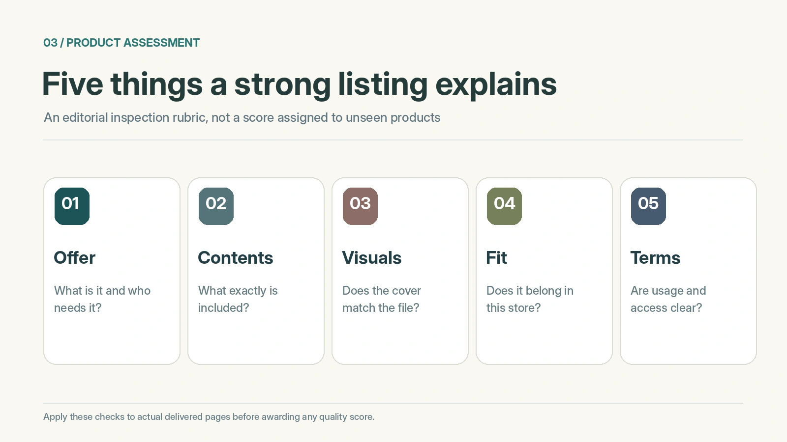
We organized the quality check around five dimensions: relevance to a plausible buyer, clarity of the offer, usefulness of imagery, consistency within the storefront and completeness of the information required before purchase. A sixth dimension, rights and product access, is a separate gate because a beautiful listing does not answer every licensing question.
Evidence status: We reviewed Sellvia’s published default-product provision, public explanations of its digital-product model and examples of public digital-product listings in the wider Sellvia ecosystem. We did not receive access to a private newly created store or its actual randomly assigned 50 product pages. Public Sellvia Mall listings illustrate the kind of digital content that may exist in the ecosystem; they are not proof that any particular item appears in the starter 50 or has identical terms in a turnkey store.
That boundary is essential. It would be easy to award arbitrary stars to unseen product pages, but doing so would turn an editorial review into invented testing. Instead, this guide makes the standard of inspection explicit and shows what a strong starter collection should accomplish.
A prepared product page has real practical value
Starting from a blank storefront means producing a product concept, customer-facing explanation, cover art, file format, purchase proposition and page layout before even evaluating the customer experience. A preloaded selection reduces that initial content-production workload. The merchant can spend more time deciding which offers fit the brand, whether the descriptions speak to actual needs and which pages should receive attention first.
That is a meaningful operational advantage for a beginner. It does not turn every default item into a bestseller; it moves the first set of tasks from creation to selection and improvement. Those are different skills, and the second is easier to practice when there is real material on the screen. A store owner can review a live-looking product page and identify specific changes instead of inventing the entire structure at once.
For the underlying catalog workflow rather than this quality assessment, see the product catalog explanation on sellvia.info. Our focus is whether the starting pages make a convincing customer-facing collection.
What we look for in a digital-product title
A useful title should identify the format or outcome without forcing the shopper to decode a vague slogan. “Weekly Budget Planner – Editable Template” communicates more than “Money Success Secrets.” A course title should make its subject and learning level clear; a guide should identify the question it answers; a checklist should tell readers what action they can complete with it.
This does not mean every name must be long. Titles work best when they avoid stuffing unrelated search terms and make a specific promise that the actual content can support. For example, “A Simple Project Planning Template” may be better than an oversized string listing productivity, leadership, finance and career keywords. The buyer should be able to tell what the product is before opening the details page.
During an audit, mark titles that are too generic, duplicated across similar items, or inconsistent with their accompanying image. A prepared title that already captures the format and use case saves the merchant substantial rewriting. A weak one is a reason to improve the presentation where the platform permits, not a reason to dismiss the entire ready-made model.
Descriptions should answer the buyer’s next five questions
A high-quality product description explains who the product is for, what is included, how it is used, which format the buyer receives and what limitations apply. The first paragraph should answer the buyer’s immediate question, not spend several sentences on general inspiration. An ebook needs a topic and scope; a template needs the environment in which it works; a course needs an outline or at least a clear skill outcome.
A useful description also avoids treating all claims as equally provable. “Includes three printable planning worksheets” is a concrete attribute. “Will transform your life” is an outcome promise that cannot be demonstrated from the existence of the file. Editors should prefer the former. Buyers appreciate knowing whether a resource is introductory, advanced, editable, downloadable, or intended for personal rather than professional use.
When assessing a Sellvia product page, compare the headline, bullet points and main description. They should tell one coherent story. A good preloaded listing can be polished without overwhelming the visitor, and that clarity is worth more than a long description full of repeated phrases.
Cover images: visual information rather than decoration
Digital products often have no physical object to photograph. Their cover artwork therefore does two jobs: identifying the content and suggesting its form. A serious quality check examines legibility at thumbnail size, adequate contrast, consistent file typography and whether the image is relevant to the actual guide, course or template. An attractive mountain photograph is not sufficient evidence that a workbook contains practical exercises.
Avoid promoting pictures that imply a physical package if the customer receives a digital file. Likewise, do not show a complicated dashboard when the product is a simple PDF. A strong set of covers makes categories visually distinct while remaining obviously part of the same store. When images share a coherent typographic system, the storefront can look curated even though the underlying products come from a common library.
A cover’s value is therefore editorial, not merely aesthetic. It should help customers recognize a budgeting template versus a video lesson before they read the full paragraph. The quality of the images should be judged both individually and in the grid where real browsing happens.
One store should feel like one point of view
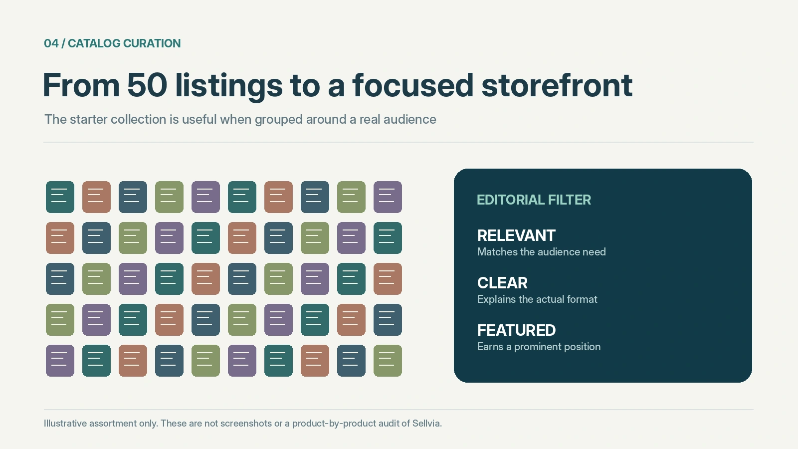
Fifty random starter items may cover unrelated topics. That flexibility is useful for exploration, but an indiscriminate collection can make a storefront harder to explain. A visitor who came for career-planning resources may be confused by unrelated mindfulness, personal finance and home organization products presented with equal prominence. The solution is not necessarily deleting everything. It is creating an intelligible hierarchy of what the store stands for.
An editor would begin with an audience sentence: “This store helps new freelancers organize client work,” for example. Then review whether each product supports that objective directly, indirectly or not at all. The first group belongs in the most visible sections. The second may become a complementary category. The third can be left out of primary navigation or removed if the interface and terms allow.
The favorable aspect of Sellvia here is that there is already material to curate. The owner gets to make merchandising decisions with a selection in hand, rather than spending the first week building each product from scratch. Curation becomes the way to make the ready-made experience feel personal.
A sample evaluation rubric that avoids fake scores
Use the following rubric on a real delivered store. It is an inspection method, not a performance score awarded to Sellvia without access to the actual items.
| Review area | Strong listing | Needs editorial attention |
|---|---|---|
| Title | Names format, topic and use case | Generic or misleading wording |
| Description | Explains scope, contents and recipient | Repetitive benefits without substance |
| Artwork | Readable, relevant, consistent | Blurry thumbnail or unrelated imagery |
| Audience fit | Belongs beside the store’s core offers | Introduces unrelated themes |
| Buyer information | Format and access are clear | Unanswered compatibility or usage questions |
| Trust | Accurate claims and recognizable support route | Unsupported outcomes or contradictory details |
A simple traffic-light notation is sufficient during the first pass: ready, needs revision, or requires clarification. Do not invent numeric precision. The goal is to identify the highest-impact improvements before inviting visitors to browse.
What a useful first 10-product review looks like
Rather than skimming all 50 and marking them acceptable, inspect ten representative pages carefully. Include the most prominent homepage item, a product from each important category, the lowest-priced and highest-priced item in the visible set, and anything with unusually long or short copy. If the default collection is truly varied, this small first pass will reveal whether naming and presentation are consistent.
For each chosen page, read the headline without the image and the image without the headline. Do they indicate the same product? Scan the product format, price display, description, access instructions and related items. Then look at the page on a phone: does the crucial information remain visible without excessive scrolling? If possible, verify the actual digital content using a legitimately obtained preview or purchase; never infer file quality solely from a cover.
This approach produces meaningful editorial notes quickly. If the first ten pages are strong and representative, the rest can be reviewed more efficiently. If problems repeat, the owner has a prioritized editing list rather than a vague complaint that the catalog “looks generic.”
Product files and licensing are separate checks
A product listing is a public promise, whereas the licensed content is what a buyer ultimately receives. Sellvia’s terms describe digital products including guides, ebooks, courses and informational materials, and set out their relevant use and rights arrangements. The store owner should not assume that subscription access to catalog assets creates independent ownership of source files, unrestricted resale rights outside Sellvia or a perpetual license after cancellation.
For a practical review, ask whether the displayed item matches the format described and whether permissions for selling it through the Sellvia environment are clear. If there are restrictions on modification or reuse, those should be understood before building a brand promise around the product. The article does not claim to have reviewed the contents of 50 downloadable files; that would require a separate, documented sample.
This distinction actually strengthens the positive assessment of a prepared digital catalog. The convenience is meaningful when the operator knows precisely which rights and workflows are included, instead of treating access to an asset as equivalent to owning it.
Merchandising decisions after the initial audit
Once the page-level review is complete, the next step is arranging the selection. Feature a small group that best expresses the audience’s needs; group the remaining relevant products under understandable categories; and make the navigation short enough to use comfortably. Related resources can be described as a learning path, such as introduction, practice and templates, if their actual contents support that relationship.
Avoid promoting five almost identical guides at the top of the store merely because they were preloaded first. The customer should see a reason to compare them. If items overlap, explain the difference in depth, format or target audience. A store becomes more useful when it helps a visitor choose, not just browse a long catalog.
This is where the platform’s prepared structure is useful for a nontechnical merchant. The essential product-page framework exists; the operator can spend limited editorial time on selection, prioritization and clear customer language. Those tasks can improve coherence without pretending that reordering products automatically raises revenue.
Public examples are not the same as the private starter set
Sellvia’s wider ecosystem includes publicly visible digital-product listings, including categories and descriptive titles on Sellvia Mall. These public pages demonstrate the types of information digital sellers commonly present: a product title, visual, price, topic and sometimes customer feedback. They are useful as design references for an editorial checklist.
But it would be misleading to say that a public Mall item is one of the 50 random turnkey products unless its inclusion was documented in the delivered store. Nor should public Mall ratings be transferred to other storefronts as if they were verified customer feedback for that merchant. The platforms, offers and account-specific selections may differ.
The broader lesson is that good public examples help establish what to check, while a defensible quality verdict about the actual initial 50 requires a dated inventory export and access to its product pages. Keeping those evidentiary layers separate makes the review more credible.
What remains to be tested on a real account
A full private-store audit would capture the initial product count at handover, the distribution across categories, each page’s headline and description, image dimensions, file format and actual product access. It would also document any missing previews, inconsistent labels or unusual duplicates. After any changes, the auditor would revisit the pages to confirm that published edits are visible to a visitor.
We have not performed that account-level audit. Consequently this article does not present an invented list of 50 titles, fabricated screenshot comparisons, untested download quality or an average listing score. It provides a verification-ready framework grounded in the documented offer. Readers who have a store can apply it, and the publication can update the evaluation when a representative set of delivered product pages is available.
The absence of unsupported claims is a feature of the editorial standard, not a reason to dismiss Sellvia’s documented head start.
Editorial verdict: a valuable starting inventory, best used selectively
Our assessment is positive about the ready-made starting point. Having digital products already placed in the store is substantially more useful than receiving an empty website and a blank product editor. Sellvia’s documented provision of 50 default items gives a beginner material to review, organize and present immediately. The platform’s catalog can then support further selection according to the account’s terms.
We would not award a universal five-star score to the quality of unseen files or imply that random assortment guarantees niche fit. The strongest next step is a short, methodical check of titles, descriptions, artwork, formats and customer relevance. If those elements are coherent, the starting collection can help a merchant reach a professional-looking storefront with less content-production work. That is the tangible, defensible advantage.
Frequently asked questions
Does every Sellvia store start with exactly 50 products?
The general free-turnkey clause states 50 random default products. Other current promotional packages describe different preloaded counts. Check the terms and handover details for the offer actually purchased or activated.
Are the 50 items selected for my niche?
The default contractual language calls them random products. Do not assume personalized curation unless your particular offer or store handover explicitly provides it. You can still curate how the supplied collection appears to customers.
Did this review inspect the content of all 50 files?
No. We reviewed public documentation and the quality standards a delivered store should meet. No private starter inventory or download sample was provided, so we do not claim a completed file-by-file test.
Can I change descriptions and images?
The extent of permitted edits depends on the store interface and current service terms. Review your specific account before assuming unlimited modification rights to third-party or Sellvia-licensed content.
Is a larger product count always better?
No. A coherent set of relevant, well-explained offers can be easier for buyers to understand than a larger collection with no visible theme. Start by improving the most relevant pages rather than treating volume as a substitute for quality.
What should I audit first on my own store?
Start with the homepage’s featured item, leading category pages and a selection of ten representative products. Check titles, actual format, cover readability, clear use cases and whether the listings work on mobile.
Source notes. Sellvia Terms of Use; Sellvia’s current public product overview; public Sellvia Mall categories (illustrative only); Sellvia.info catalog guide. Checked November 5, 2026.

Robert Gross is a contributing writer at Sellvia.co with a strong interest in ecommerce operations and the economics behind digital selling platforms. His articles examine how Sellvia’s tools work together in real business scenarios, including store setup, advertising, order processing, performance tracking, and cash-flow planning. Robert focuses on the operational details that are often overlooked, helping readers form realistic expectations, recognize potential challenges, and approach online business decisions with greater clarity.
Leave a Reply