Can a new owner find a clear path from first login to a usable store?
The first ten minutes with an ecommerce platform are rarely about business strategy. They are about finding the right door, recognizing what has already been prepared, and deciding what to do next. That is why I approached Sellvia’s guided onboarding as a usability question rather than another generic explanation of how to open a store. The offer of a prepared storefront is appealing, but the more interesting question is whether a beginner can move from an unfamiliar welcome screen to an understandable daily routine without spending the first afternoon deciphering jargon.
My assessment is positive about the structure of that proposition. Starting with a store, hosting, and access to an established catalog removes several decisions that would otherwise come before the first useful action. The remaining challenge is orientation: a user still needs to distinguish an account from the customer-facing store, an included tool from a paid upgrade, and a dashboard estimate from a business result. A genuinely good onboarding experience makes those distinctions easy to notice.
First, find the correct entrance
Sellvia’s current public account login asks for an email address and offers to send a login link. That is a relatively straightforward entry point for somebody who dislikes managing another username and password. I especially like the implied simplicity: the same email that identifies the subscription becomes the starting point for access. A new user should nevertheless be careful about which mailbox was used at signup, because possession of that mailbox is part of getting inside.
There is an important usability detail here. An older public community instruction refers to an account.sellvia.com address, whereas the current login page is at dashboard.sellvia.com. This is exactly the sort of change that makes a newcomer wonder whether an instruction is obsolete. It does not invalidate the email-link approach, but it does demonstrate why the live login page and the user’s authentic welcome message should outrank an old screenshot. To my eye, the strongest onboarding copy is copy that explains the underlying step without depending on a single historical URL.
The first successful login should answer one question
A beginner does not need to see every metric at once. They need a clear answer to: what belongs to me, what is ready, and what should I check first? Sellvia’s ready-made store is an advantage in this respect. Instead of beginning from an empty website template, the new owner can evaluate an actual storefront and then decide which parts of the experience deserve attention. That immediately changes the emotional quality of setup from creation under pressure to review and refinement.
I would judge a successful first login by orientation, not by animation or the number of tutorial bubbles. The account should make the store address discoverable, identify where products can be examined, and indicate how to reach legitimate support. Optional paid services should be visibly separate from essentials. A novice who can explain those four facts after one session has learned more than a novice who has clicked through a dozen celebratory screens without understanding the account.
Storefront versus dashboard: two different jobs
The storefront is what a visitor eventually sees. The dashboard is where the owner inspects the state of the business and the services attached to the account. This sounds obvious until a first-time user starts searching for a public product page inside an administrative panel or mistakes an administrative status card for a customer-facing feature. The clearest guided onboarding builds a small mental map between these spaces.
My preferred check is to open the public store in one tab and the account in another. Compare what appears on each side: branding, the product catalog, navigation, and any customer-oriented pages. There is no need to activate advertising or purchase an add-on to learn this distinction. A strong ready-made offering makes the comparison reassuring, because there is already something substantive to inspect. The key benefit is reduced blank-page anxiety, not a promise that the storefront is automatically differentiated from every competitor.
What the ready-made starting point actually saves
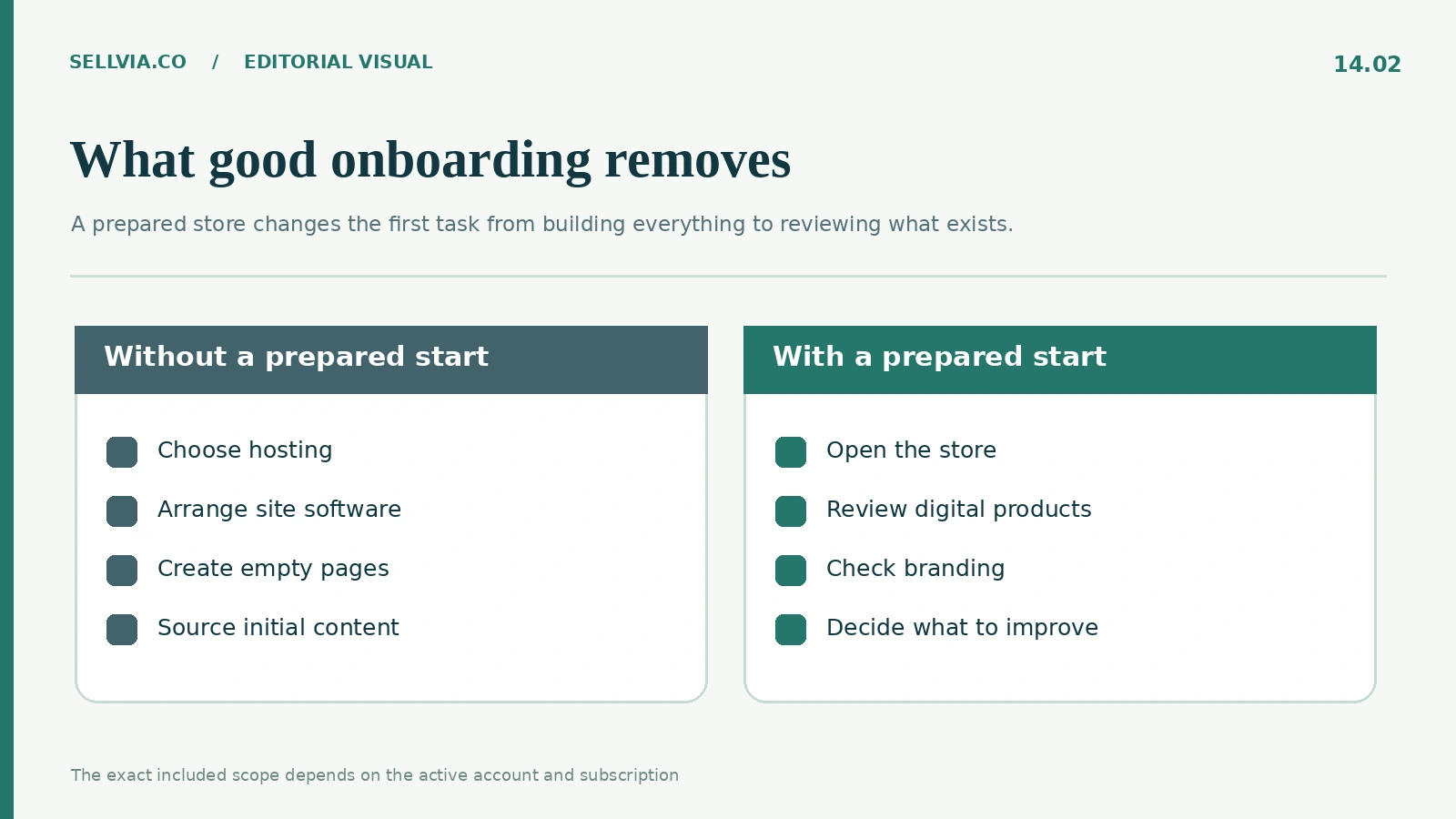
Building a small ecommerce site independently can involve separate choices about hosting, a theme, a domain, product content, and basic configuration. Sellvia brings much of that together as a subscription service. From an onboarding standpoint this is meaningful: the first session can focus on judgment rather than assembling the technical stack. It is particularly attractive for a person who wants to evaluate the business model before becoming a WordPress administrator or a hosting specialist.
The value is practical, not magical. A ready website still deserves a design review, and included product material still deserves an editorial quality check. I would inspect the main navigation, a sample of product detail pages, contact information, and the path a customer takes to a digital purchase. That is the right kind of beginner work: finite, observable, and more useful than an abstract promise that everything runs itself.
Digital products provide a manageable first assignment
Sellvia’s current public product explanation emphasizes digital materials such as courses, guides, and templates. That creates a useful first task for a new store owner. Choose three unlike digital products and examine their thumbnails, descriptions, audience fit, and expectations about what is delivered. The exercise reveals whether the store feels coherent without turning the session into a lesson about importing dozens of listings.
I recommend looking at a product that needs a strong instructional promise, a template whose purpose should be obvious at a glance, and a guide that relies on description quality. A first-time owner quickly learns the difference between a catalog entry and a clear offer. The best onboarding system reduces the friction of finding these items and provides a logical route back to the store after reviewing them. That is a more realistic test of usability than counting how many products appear on the first screen.
The critical distinction between included and optional
A platform with an extensive service ecosystem can look generous and complex at the same time. Sellvia’s Terms explicitly say that optional tools, subscriptions, prices, and even dashboard versions may differ by account. This matters to onboarding because a prominent card is not necessarily an included entitlement. The first session should establish a clean boundary between what is already covered by the main subscription and what requires a new purchasing decision.
My editorial preference is for users to postpone optional purchases until they can explain the purpose of each one. An attractive marketing tool is not automatically useful before the owner understands the store and the products. The strongest part of Sellvia’s ecosystem is choice, but choice becomes an advantage only when the interface lets a beginner proceed at their own pace. An interface that supports exploration before commitment earns more trust than one that equates progress with spending.
Do the early labels make sense?
Terms such as orders, catalog, commission, services, balance, and performance can sound familiar while describing very different mechanisms. A good onboarding flow pairs each with a short, operational explanation. The word orders, for example, should answer what event creates an order and what action follows. A service tile should answer whether it offers access to a tool, provides a finished deliverable, or involves work performed by a team.
I would rather see five precise labels than thirty vague promises. This is also where external beginner reviews help in a limited way. Capterra’s Sellvia page currently reports a 4.7 ease-of-use score, which is encouraging evidence of user sentiment, not a live walkthrough of every version. It supports the broader impression that the product appeals to novices. It cannot tell us exactly what buttons a reader will see after signing in today.
A beginner should have an obvious next action
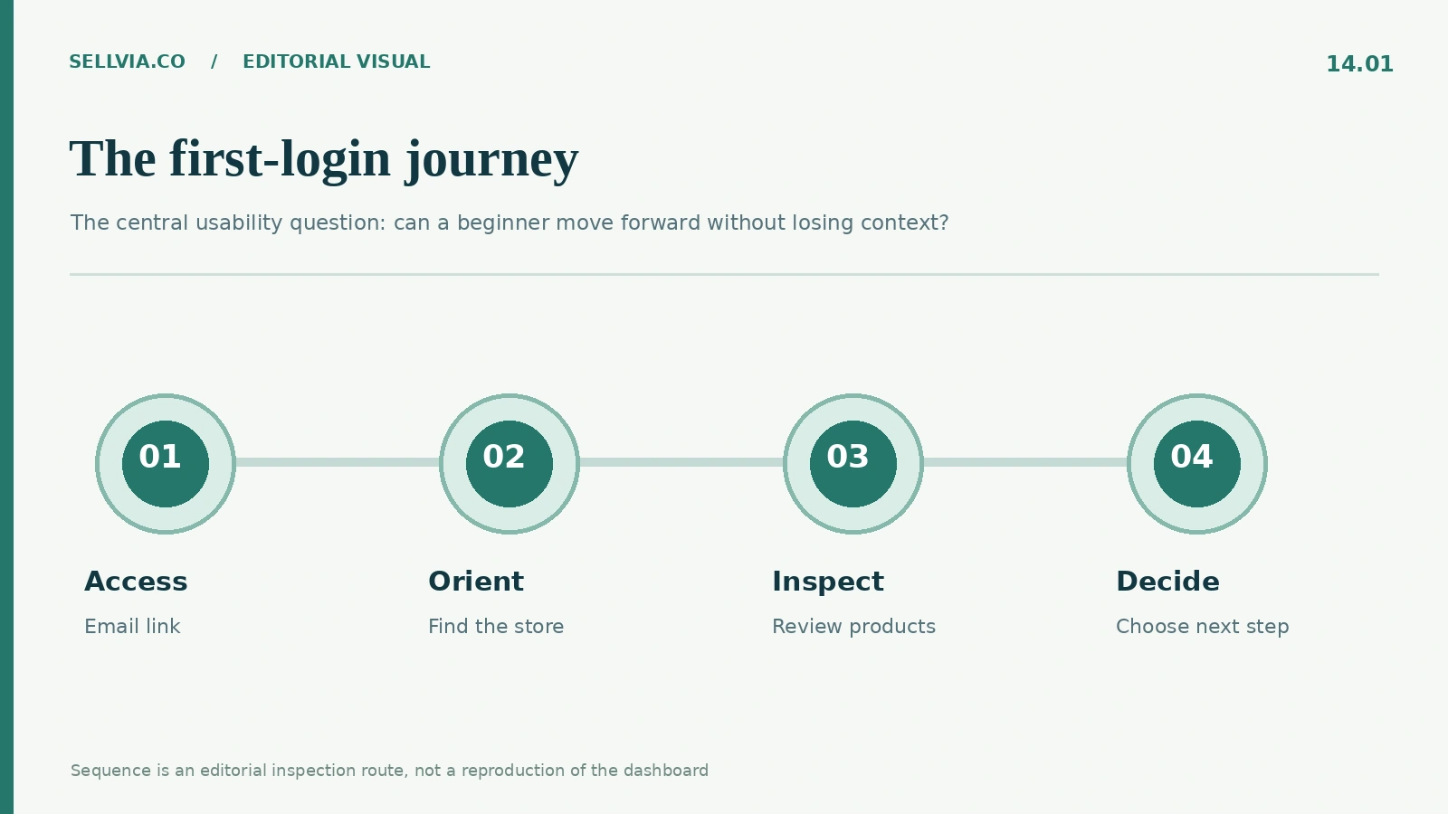
The best guided onboarding does not make every possible business activity feel urgent. After opening the account, I would place the following actions in a sensible order: confirm the store address, browse the public storefront, inspect a handful of digital product pages, find account support, and review active subscriptions. That sequence gives the owner enough information to make the next decision without paying for an upgrade or interpreting revenue projections.
This order also helps prevent frustration. Trying to run a promotion before understanding the product pages creates unnecessary uncertainty; tweaking design before confirming the public address can have the same effect. A good onboarding experience is not simply fast. It protects a beginner from working on the wrong problem first. Sellvia has the structural potential to do that because it starts from a prepared environment rather than an empty installation.
One account may not look like another
A particularly important detail in the current terms is the possibility of multiple dashboard versions. Available services, layouts, prices, and import limits can depend on the version assigned to a specific account. This is a reasonable reality for an evolving platform, but it changes how an independent publication should evaluate onboarding. A screenshot from a friend, an old video, or a community answer should not be treated as a guaranteed menu map.
For a beginner, the practical response is simple: use the actual account as the reference point, and ask support about discrepancies rather than assuming a missing button represents a malfunction. From an editorial perspective, adaptability becomes one of the qualities worth measuring. A beginner-friendly system should still make its essential tasks understandable even as specialized tools and promotions vary across accounts.
Helpful support belongs inside the first-hour experience
Support is sometimes presented as a rescue service for when something fails. I think that understates its value to onboarding. The knowledge that a person can ask a narrowly framed question changes the way someone approaches unfamiliar software. The most useful initial question is not “How do I make money?” but something verifiable: “Where can I review the storefront included with my subscription?” or “Which available tools are included in my current plan?”
An effective answer would be concise, identify the relevant place in the account, and avoid turning a basic question into an unrequested sales conversation. Sellvia’s public login page includes a route to contact support, which is encouraging. Response speed and case resolution require a real interaction to measure; I would not invent them. The meaningful positive point is that support is part of the onboarding design rather than an entirely separate hunt.
Mobile access is a useful second-pass check
Even when a business is set up on a computer, a beginner may later return to check something from a phone. Sellvia describes account and storefront access across device types, and its mobile app has its own publicly listed functionality. The important question for onboarding is not whether every desktop operation should be repeated on a small screen. It is whether the basic state of the store can be recognized without losing context.
I would check that primary labels remain legible, that the user can identify the correct store, and that the next action is not hidden behind an unclear icon. An app rating or store listing is useful supporting evidence but cannot substitute for examining the specific account. Mobile friendliness is part of continuity: a good first experience should remain comprehensible when the owner returns for a two-minute check on a different device.
Where onboarding feels genuinely valuable
The strongest case for guided onboarding is someone with limited technical time who still wants to make informed decisions. Sellvia’s prepared storefront, included infrastructure, and connected product catalog reduce the number of external services the owner has to coordinate. That is an advantage in attention, not just setup speed. It allows the user to inspect a concrete business environment early rather than postpone all useful decisions until after a technical build.
The experience is less compelling for someone expecting complete freedom to customize every architectural detail from the first click. A system built around a managed subscription naturally has boundaries. What matters is whether those boundaries are legible, and whether the owner can tell what can be changed, what depends on support, and what requires an additional service. I see clarity about the boundaries as a positive quality, not as a failure of the product.
An editorial scorecard for the first session
To judge guided onboarding fairly, I use a small set of observable questions rather than assigning an invented numerical score. Can the user sign in using the documented method? Can they find their public store? Can they inspect the catalog? Can they locate support? Can they distinguish included functions from offers? Can they identify a sensible next step? Each answer should be grounded in a visible screen, public instruction, or actual account evidence.
The beauty of this framework is that it does not reward flashy graphics for their own sake. It rewards useful orientation. Sellvia starts ahead of a completely DIY setup on the preparation side, but the remaining steps still matter. The independent verdict should therefore recognize a real design advantage while leaving room for differences between account versions and a user’s own level of confidence.
A practical first-hour sequence
If I were helping a novice evaluate a new account, I would make the session deliberately small. Spend a few minutes on access, then open the storefront as a visitor. Look at three digital products, note any confusing description, return to the dashboard, and find the subscription summary. Keep one note of the exact feature or menu that remains unclear. Only then decide whether support is needed. No large advertising decision belongs in this first-hour exercise.
This is where the platform’s strongest idea becomes visible. A ready-made store changes the user’s job from constructing the whole environment to inspecting and improving an existing one. The first session can produce a useful judgment even without a sale, a marketing campaign, or a paid add-on. That is the standard I would use to judge whether an onboarding experience respects a beginner’s time.
My editorial verdict
Sellvia’s guided onboarding has a convincing underlying advantage: it reduces the technical decisions required before a newcomer can see a functioning store and a relevant product catalog. The email-link login is a simple starting point, and the connected service environment supports a logical first session. For beginners, that is a meaningful benefit. The most important improvement would be consistently clear boundaries between account areas, included services, and optional purchases, especially when dashboard versions differ.
I would recommend evaluating Sellvia on the quality of that first hour, not on a promise of effortless income. Look for orientation, a sensible next step, and a storefront that you can understand. Those are the qualities that make a prepared store genuinely useful rather than merely impressive in a sales presentation.
Frequently asked questions
Is the Sellvia first login password-based?
The current public dashboard page invites the user to enter an email address and receive a login link. Follow the exact instructions associated with your own account and use the email supplied at signup.
Does guided onboarding mean the store is customized for me?
A prepared storefront reduces initial construction work. It does not establish that every visual, product, or branding decision is customized for a particular owner. Review the actual store before drawing that conclusion.
Must I buy optional services during the first login?
No universal requirement to purchase every additional service follows from the core onboarding proposition. Review the features included with your assigned plan and consider extras separately.
Why do older screenshots look different?
Sellvia explicitly allows different dashboard versions and evolving feature availability. Public instructions can also predate redesigns. Compare any historical screenshot with the current account.
What should I check before doing anything else?
Confirm access, find the public storefront, inspect a small sample of digital product pages, identify support, and review the subscriptions currently attached to the account.
Is a ready-made store the same as guaranteed sales?
No. A prepared environment may save technical work, but demand, positioning, promotion, and the quality of decisions still matter. Onboarding quality and business outcomes are different questions.
Sources and further reading
Sellvia current account login: https://dashboard.sellvia.com/login
Sellvia public login guide: https://community.sellvia.com/help/post/how-to-login-sellvia-account-7s1TGUx8nRKsKj8
Sellvia Terms of Use, Dashboard Services: https://sellvia.com/terms-of-use/
Independent user ratings: https://www.capterra.com/p/253268/Sellvia/reviews/
Existing sellvia.co platform overview: https://sellvia.co/how-does-sellvia-work/

Andrew Porter is an ecommerce writer and online business researcher at Sellvia.co. He focuses on Sellvia’s platform features, pricing, digital product tools, built-in advertising, order management, and payment processes. Andrew creates clear, research-based content that helps beginners understand how the platform works, assess the required budget, explore its advantages and limitations, and make more informed decisions about launching an online business.
Leave a Reply