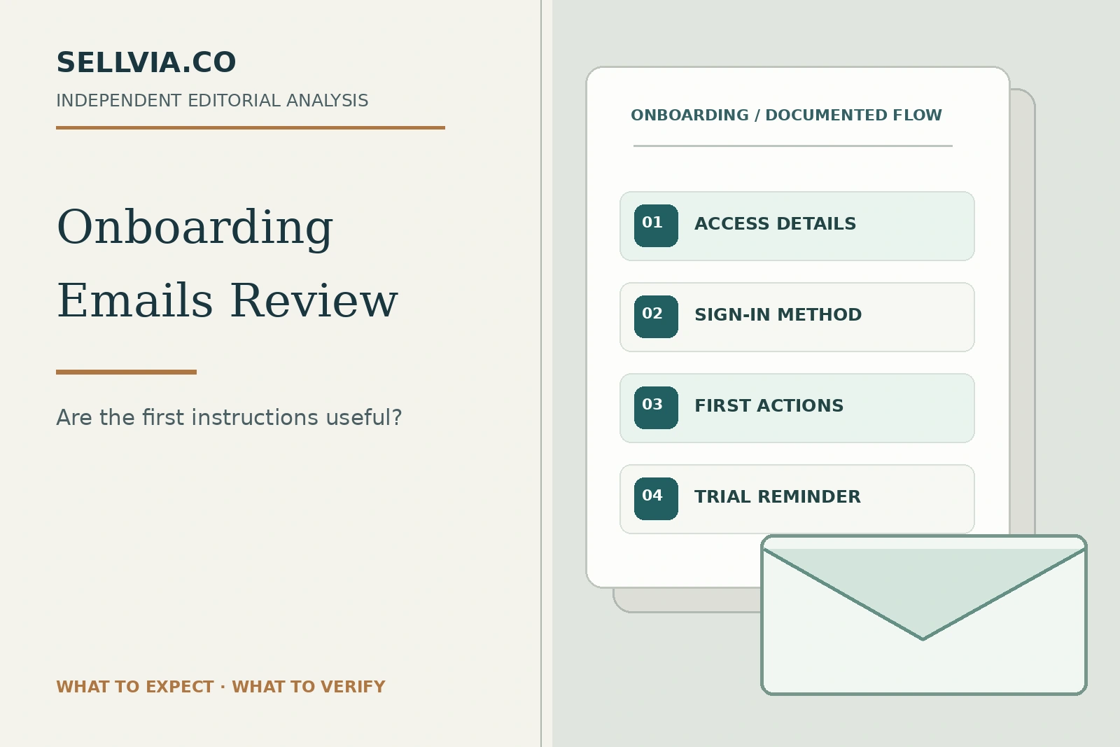
From the first access message to a more confident first week: what good Sellvia onboarding should accomplish.
Independent editorial assessment · November 9, 2026
The first email after joining a business platform has an unusually important job. It has to turn an abstract purchase into a clear next action. When I evaluate onboarding, I want to know whether a new owner can find the store, recognize the correct sign-in route and understand what to focus on before getting lost in extra offers. Those are the questions I used to assess Sellvia’s early customer journey.
What I like about the way Sellvia structures the journey is the emphasis on getting access to a prepared store before asking the owner to make every decision from scratch. The strongest onboarding message would build on that advantage: one useful link, one practical task and a clear explanation of what comes next. Below I look at the published sequence from that reader-first perspective, including the places where clearer communication would be particularly valuable.
Our editorial approach is positive but specific: we assess whether the information published by Sellvia gives a first-time owner an intelligible route from checkout to store access. We also identify the points where only a genuine registration and a recorded set of received emails could turn a reasoned assessment into a verified customer-journey test.
1. The access email is the first real handoff
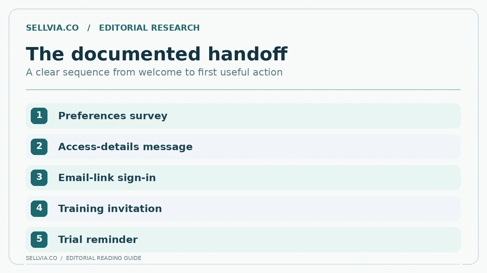
Sellvia’s current public offer says that after completing the initial preferences survey, store access details arrive by email. That is a sensible handoff design. The user already has one address associated with the purchase and can return to the instructions later without keeping a checkout tab open. A good access message should identify the account, the correct sign-in destination, the store address if available and the next step in one compact view.
We found that the public site explains the relationship between the survey and receiving access. The public Terms also distinguish trial timing from broader signup marketing copy. That makes the access message more than a welcome greeting: it is a possible reference point for the beginning of trial eligibility and an important piece of account documentation.
My take. For me, a welcome email succeeds when it answers three questions without scrolling: where is my store, how do I enter the account, and what should I do first? The published access journey has the right building blocks for that. I would value a direct destination and a concise next step much more than a polished promotional banner.
2. How the first sign-in instruction should work
The publicly available login guide describes entering an email address and receiving a one-time login link. The live public Dashboard page also offers email-link access, which is a helpful consistency check. Someone who is new to Sellvia does not have to infer a complex authentication sequence from product advertising; the core concept is available in direct language.
An effective onboarding email should explain whether it contains a single-use sign-in link, points to a separate page that sends one, or provides other credentials for a specific account version. This precision matters because Sellvia operates different entry points and has updated login experiences over time. A message that assumes every reader uses the same screen could be unnecessarily confusing.
My take. An email-based sign-in can be a welcome simplification for someone who already has too many passwords. The message should make the destination recognizable, explain what happens after the click and make requesting a fresh link straightforward. Those are practical details that make the first encounter feel more considered and less technical.
3. A beginner needs to know what was built
The first practical question after access is not how sophisticated the interface looks; it is what has already been prepared. Sellvia publicly describes a turnkey store with a domain option, hosting, product access and some baseline setup. Putting those facts into a concise onboarding summary would save an owner from opening multiple tabs simply to determine where the work begins.
Our preferred email design would separate “already prepared for you” from “still requires your action.” For example, reviewing the public storefront and confirming the store name are different tasks from checking business communication settings or deciding whether to add another paid service. A calm separation helps build trust and prevents novices from treating every suggested upgrade as mandatory.
My take. The useful onboarding message is not ‘everything is ready’ in the abstract. It is ‘here is what has been prepared and here is what remains yours to decide.’ I would split that message into two short groups, beginning with the storefront and digital catalog, then moving to branding, contact details and optional services.
4. The survey confirmation is an easy place to prevent confusion
The Sellvia offer describes a preferences survey covering elements such as niche, design and domain. A useful follow-up email should tell the recipient whether those preferences have been received, whether action is still pending, and how to correct a misunderstanding. Without such a checkpoint, a beginner might interpret a delayed or unexpected storefront as a technical failure rather than a handoff issue.
The positive potential is substantial: a structured confirmation can reduce repetitive support requests and make the process feel guided. It also establishes a record the owner can reference when comparing what was requested with what is currently visible. Even a short message can accomplish this if it uses specific, non-promotional language.
My take. A survey is easier to appreciate when the customer understands what their answers influence. A strong confirmation would repeat the selected store direction and direct the owner to the resulting storefront once available. That helps prevent a common misunderstanding: assuming a preference submitted in a form guarantees that every later detail is fixed forever.
5. The trial clock deserves its own clear line
Sellvia’s terms define the base trial period and explain what happens as it ends. Its October 2026 public explainer also describes a reminder three days before expiration. This gives users a useful expectation that the trial is a bounded evaluation period rather than permanent unrestricted access. Clear trial information is especially valuable when the customer is exploring software while juggling another job.
The best onboarding email would place the activation date, trial end date, next expected base-plan amount and location of subscription controls together. It would also distinguish base subscription access from optional services that may be billed separately. That is not an argument against paid products; it is the information required to make a confident, informed choice.
My take. The trial reminder is where clarity becomes especially valuable. I would look for the start date, the relevant renewal date and a plain description of which services are included. There is no need for alarmist language; an informative message helps owners use the evaluation period confidently instead of repeatedly returning to the billing screen.
6. Training invitations should connect to one realistic task
Public onboarding materials indicate that a new owner may book a training session. The best training invitation would offer a specific, achievable purpose: identify the important areas of the account, clarify next actions, and show where to request help. A beginner is more likely to use a booking link when it is framed as practical orientation rather than a vague promise of success.
The editorial advantage of this approach is continuity. An email can explain a task; a guided session can address the exact obstacle a customer encounters while attempting it. This pairing makes a managed onboarding experience meaningfully different from a self-service toolkit that only supplies credentials and leaves the user alone.
My take. Training invitations have the most value when they propose a useful goal rather than just a meeting. A first-time owner might want to review a store page, find a digital product or understand an account menu. One concrete agenda item makes a guidance offer feel like a service, not another generic marketing email.
7. Security signals matter more than decorative polish
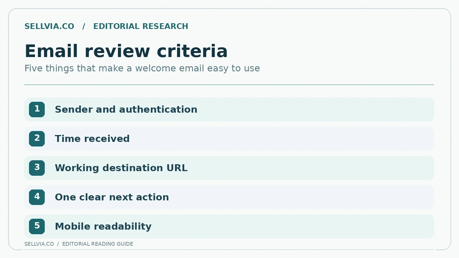
A visually attractive welcome email is not automatically a trustworthy one. New customers need to recognize the expected sender, understand why a login link appears, and avoid exposing account details to an unrelated domain. The help guide’s explanation of a login link gives a reasonable baseline for interpreting sign-in messages without guessing.
An editorial email audit would inspect the actual sender domain, the URL displayed on hover, whether the message requests sensitive information unexpectedly, and whether it gives a safe route back to the official website. We would also look for useful plain-text alternatives and accessible button labels; people often read these emails on small screens.
My take. A reader should recognize the real account destination without learning email-security jargon. I prefer a visible sender identity, a sensible action label and a clear explanation of why the sign-in link arrived. That makes the message more credible and also helps the customer avoid treating an unrelated email as an official account notice.
8. What a first-week email should prioritize
An owner in the first week needs a small number of practical actions, not a flood of promotional choices. We would prioritize locating the store, confirming public page quality, recognizing the available catalog, identifying the help area and understanding how account services are listed. Each message should point to one achievable next step and make it easy to return later.
Sellvia’s current public blog offers a day-by-day account of the first fourteen days and illustrates the value of this approach. It breaks onboarding into manageable stages rather than presenting every feature as urgent. That is a positive editorial signal about the intended customer journey, although a blog explanation is not evidence that the actual emails follow the same cadence.
My take. My ideal first-week sequence would be restrained: open the store, review the product cards, locate support, and understand the few controls needed for normal operation. Pushing too many optional features on the first day only dilutes those priorities. A calm sequence can make the existing platform feel far easier to approach.
9. Promotional emails must not blur service requirements
Some users welcome product suggestions after gaining access; others need time to understand the base service. Sellvia’s terms mention optional tools and charges that can depend on the selected Dashboard and offer. A well-designed onboarding series should label optional purchases clearly and avoid positioning them as prerequisites for using features already covered by the subscription.
That transparency supports a favorable customer experience. When a reader can distinguish education, an account notice, a training invitation and a paid add-on, recommendations become easier to trust. A call to explore more services can then be evaluated on its merits rather than being confused with an urgent security or activation notice.
My take. There is room for promotional recommendations, but I would place them after the essential account instructions. A beginner should be able to identify required steps without deciphering which buttons lead to an extra purchase. That is not a negative judgment on upsells; it is simply good information architecture for a new customer.
10. The day-eleven reminder is a meaningful checkpoint
In its public first-two-weeks explanation, Sellvia says an email reminder arrives three days before the trial ends. This is one of the most useful claims to verify in a live onboarding test because it helps a customer decide whether to continue with the base subscription. It also gives a reviewer a precise, dated observation rather than a vague impression.
We would test whether the reminder identifies the subscription, renewal date, price and self-service controls. A useful message should make the next action clear even if the customer has not opened every prior tutorial. It should remain readable on a phone and distinguish active optional services from the base plan.
My take. A reminder late in the trial is useful when it prompts a final review of the store rather than merely repeating an offer. I would want it to point back to the storefront, the account area and a short checklist of unresolved questions. That turns the message into a decision aid at exactly the moment it matters.
11. The first email series as a product experience
The real value of onboarding email lies in continuity between a promise and the next usable screen. The strongest sequence would answer three questions in order: what happened, what do I do now, and where do I go if something does not match? Sellvia has public material that can support each answer. The remaining challenge is packaging that information in the actual messages without requiring the customer to assemble it manually.
The design opportunity is particularly attractive for beginners who do not want to study an entire help library on day one. A concise email, supported by a deeper article when needed, offers control over the pace of learning. It is a service-oriented approach rather than a guarantee that running a business will require no work.
My take. Judged as a customer journey, the strongest design principle is progression. One message gets you inside, another helps you orient yourself, and later communication supports a more informed decision. I find that sequence much more persuasive than a long series of generic motivational notes with no clear relationship to the actual store.
12. What a rigorous inbox test would record
For a reproducible future audit, the editorial team would register through a clearly identified offer and save the exact consent and checkout screens. The test log would record the time access details were promised, the time each message arrived, subject and sender, all destinations and whether the email was understandable without opening additional promotional materials.
Each received message would be classified as essential access information, educational guidance, service notice or commercial offer. The evaluation would examine whether links work, whether mobile layouts are usable and whether a beginner can complete the described action. We would never present a draft email or marketing screenshot as evidence of what the platform actually sent.
My take. For an editorial inbox assessment, I would organize each received message by its purpose rather than by its subject line alone. Access, education, reminders and optional offers belong in different groups. This makes it much easier to notice a missing instruction or a confusing overlap without reducing the whole experience to a simplistic star score.
What a useful onboarding email scorecard looks like
A responsible reader may reasonably ask for one final verdict on the emails themselves. The answer is that we can rate the completeness of the public onboarding description today, but not the exact customer messages. The distinction becomes easy to demonstrate with a simple scorecard: the first column states what Sellvia publicly says should happen; the second would show the actual email received and its timestamp; the third would record whether the link worked and the next task was clear.
For instance, the documented access message is useful in principle because it moves the user from the survey toward the account. Yet without the actual subject line and access link we cannot judge whether it reached the inbox or was understood immediately. The same logic applies to a training invitation and the pre-renewal reminder. Each has a specific educational purpose, but a statement of intent is not proof of operational execution.
My take. The final measure is whether the reader knows what to do next. Sellvia’s published onboarding path offers an appealing structure for that experience. My recommendation is to keep the message sequence short, link each instruction to one practical action and make the difference between essential access and optional services unmistakable.
Editorial verdict
The documented Sellvia onboarding journey has a genuinely appealing structure: access by email, clear sign-in concepts, a prepared store, optional guidance and a time-defined trial. In our editorial assessment, those ingredients are well suited to beginners who prefer directed next steps over an unstructured software handoff. What we cannot award is a verified email-delivery score. Without actual received messages, a favorable verdict must apply to the documented design and clarity of the promised process, not to unseen inbox performance.
Frequently asked questions
Does Sellvia send store access details by email?
Its public onboarding materials say access details are sent to the address used in the process. Actual delivery for a given account requires mailbox verification.
How does email-link sign-in work?
The public account page asks for an email address and says it sends a sign-in link. Screen details can vary by account version.
Is there a trial reminder email?
Sellvia publicly describes a reminder before the base trial ends. The editorial team did not receive or time-test that message.
References and further reading
Related independent analysis: Sellvia: What It Is and How the Platform Works, Sellvia Free Trial Cancellation.

Robert Gross is a contributing writer at Sellvia.co with a strong interest in ecommerce operations and the economics behind digital selling platforms. His articles examine how Sellvia’s tools work together in real business scenarios, including store setup, advertising, order processing, performance tracking, and cash-flow planning. Robert focuses on the operational details that are often overlooked, helping readers form realistic expectations, recognize potential challenges, and approach online business decisions with greater clarity.
Leave a Reply